The distinctive ‘A’ logo symbolises ambition and growth, encapsulating the ‘reach higher’ design concept


Use of colour ways to differentiate divisions within a cohesive identity system

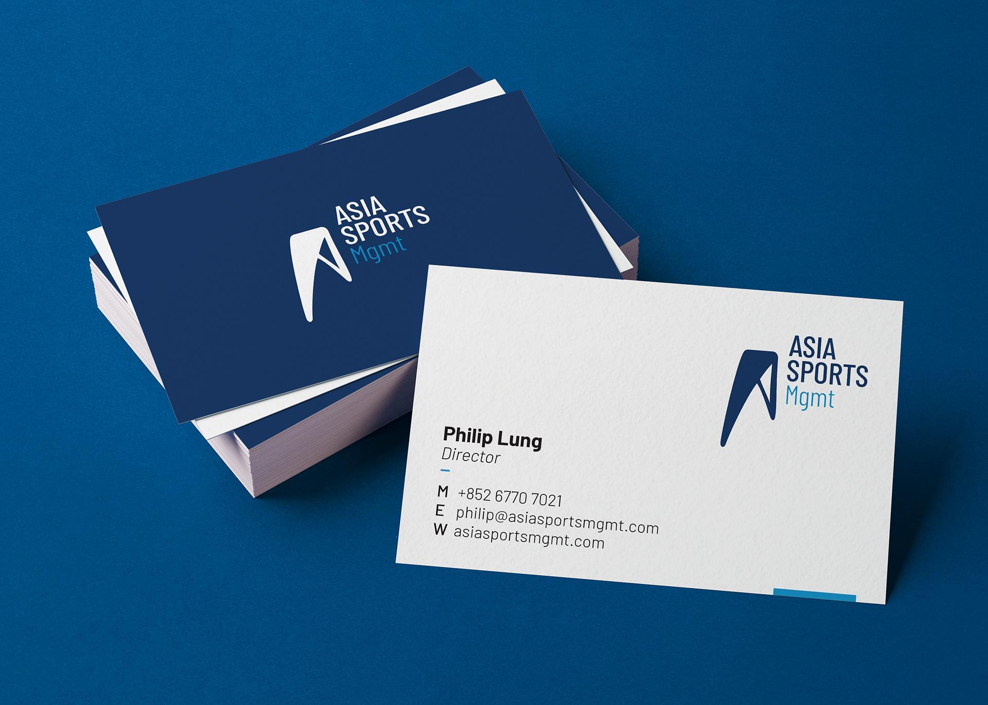
Identity design for the sport management company Asia Sports Management is a newly established tennis academy and sports consultancy based in Hong Kong, serving as a one-stop shop for coaching, management, and events. Brief: The brand needs an identity that captures its role as an integrated hub dedicated to inspiring junior athletes to develop and achieve their full potential. Solution: A logo embodying the spirit of reaching higher, developed within a versatile identity system to clearly distinguish each division.
The distinctive ‘A’ logo symbolises ambition and growth, encapsulating the ‘reach higher’ design concept