
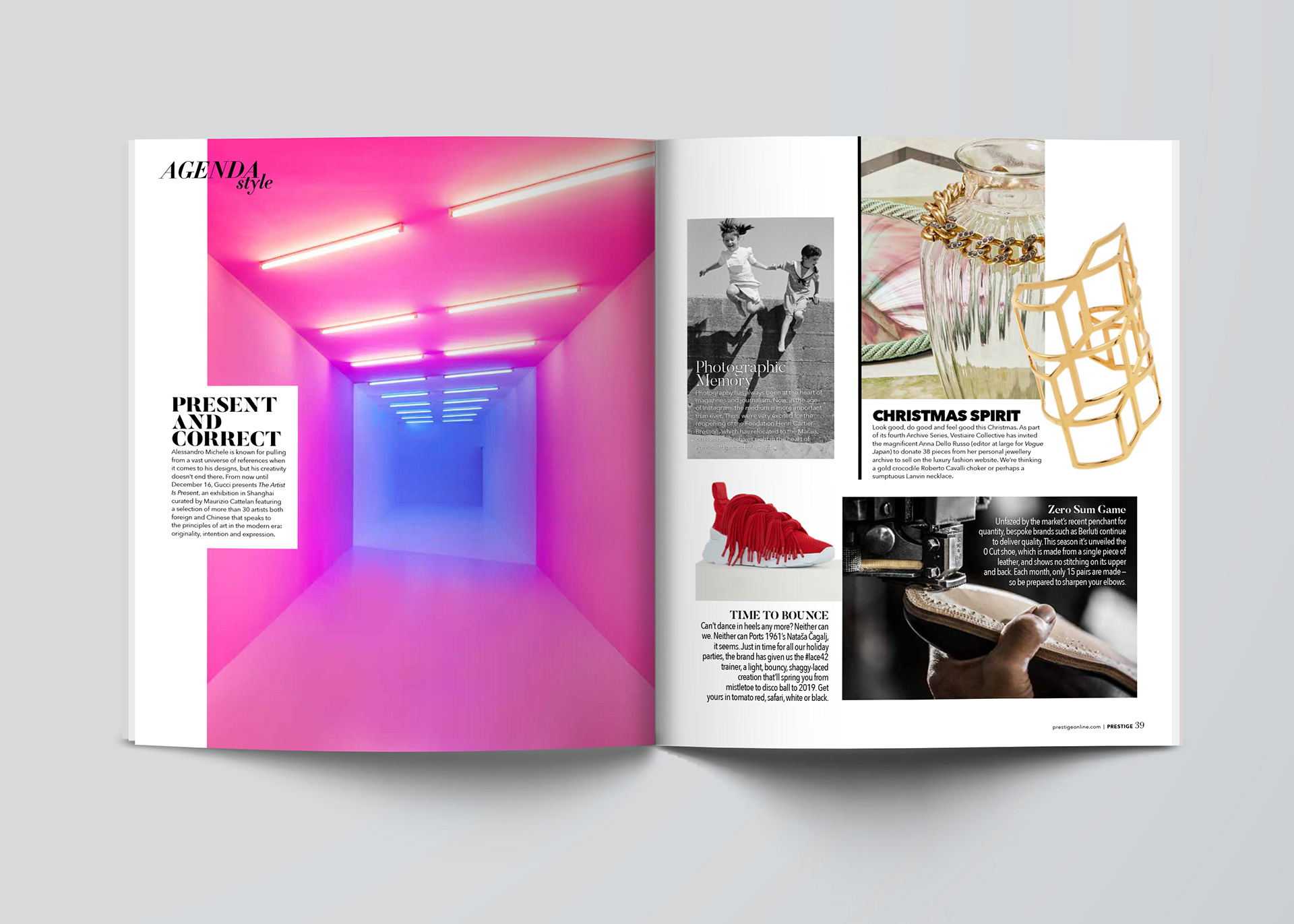

A carefully selected typeface to establish visual hierarchy and guide readers through the page
Off-grid placement of design elements to draw interest by creating tension and breathing energy into the page.
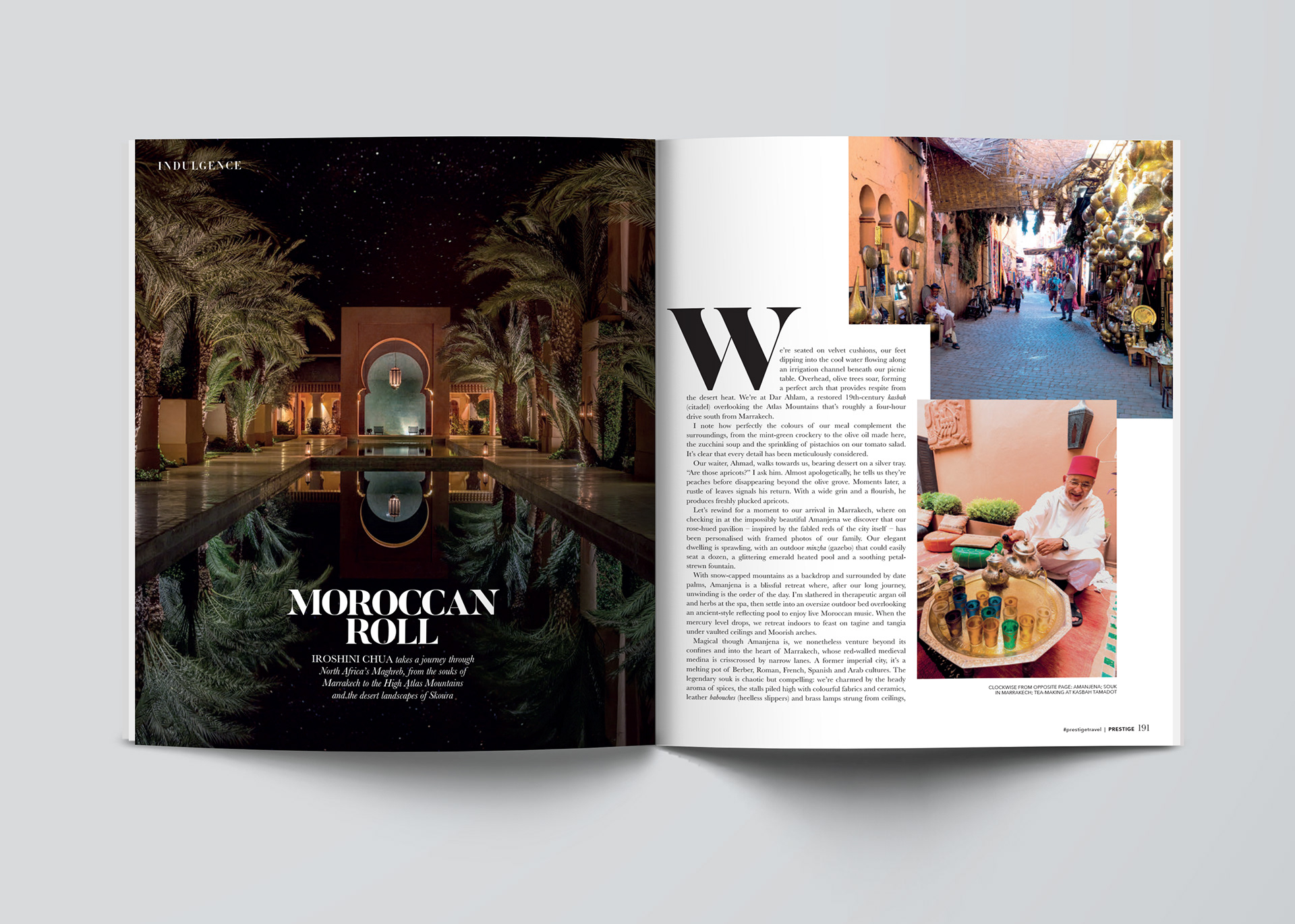
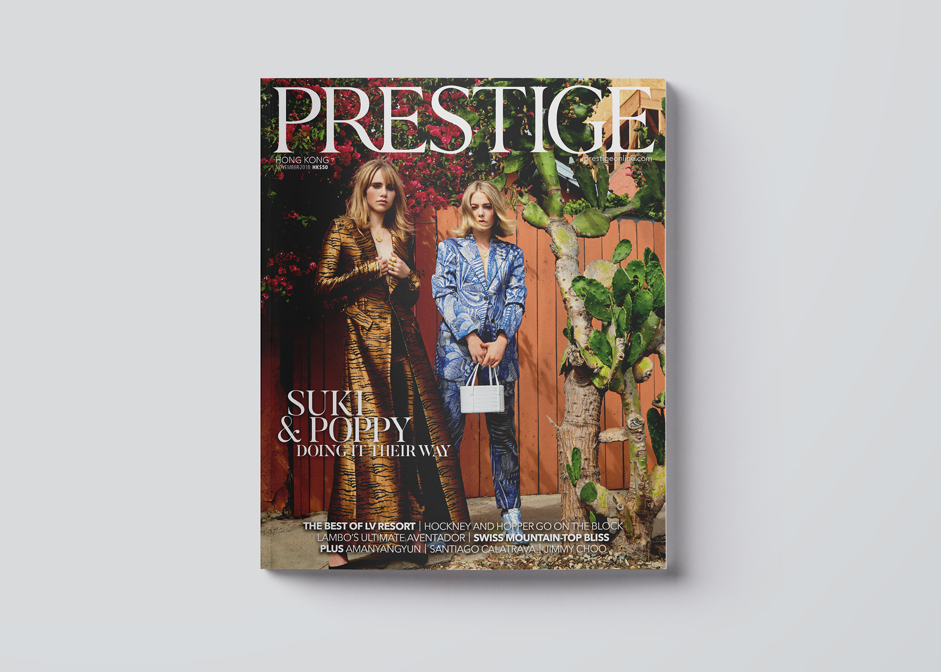
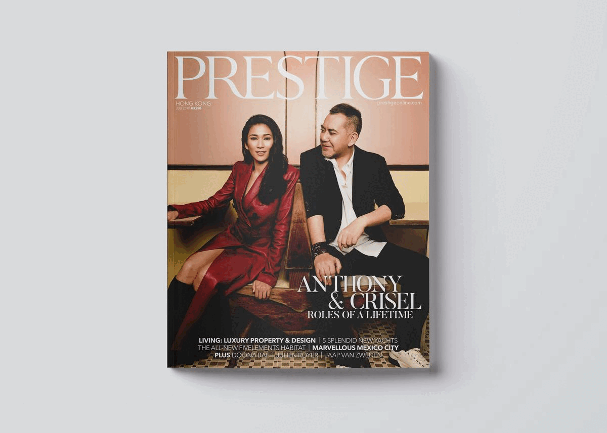
Creative direction for the luxury lifestyle magazine Prestige is a luxury lifestyle magazine for Asia’s elite, covering high society, fashion and culture across the region. Brief: The brand sought a publication that resonates with its discerning Hong Kong audience. Solution: A sophisticated and cohesive design, thoughtfully crafted to reflect Prestige’s exclusivity and appeal to refined tastes.
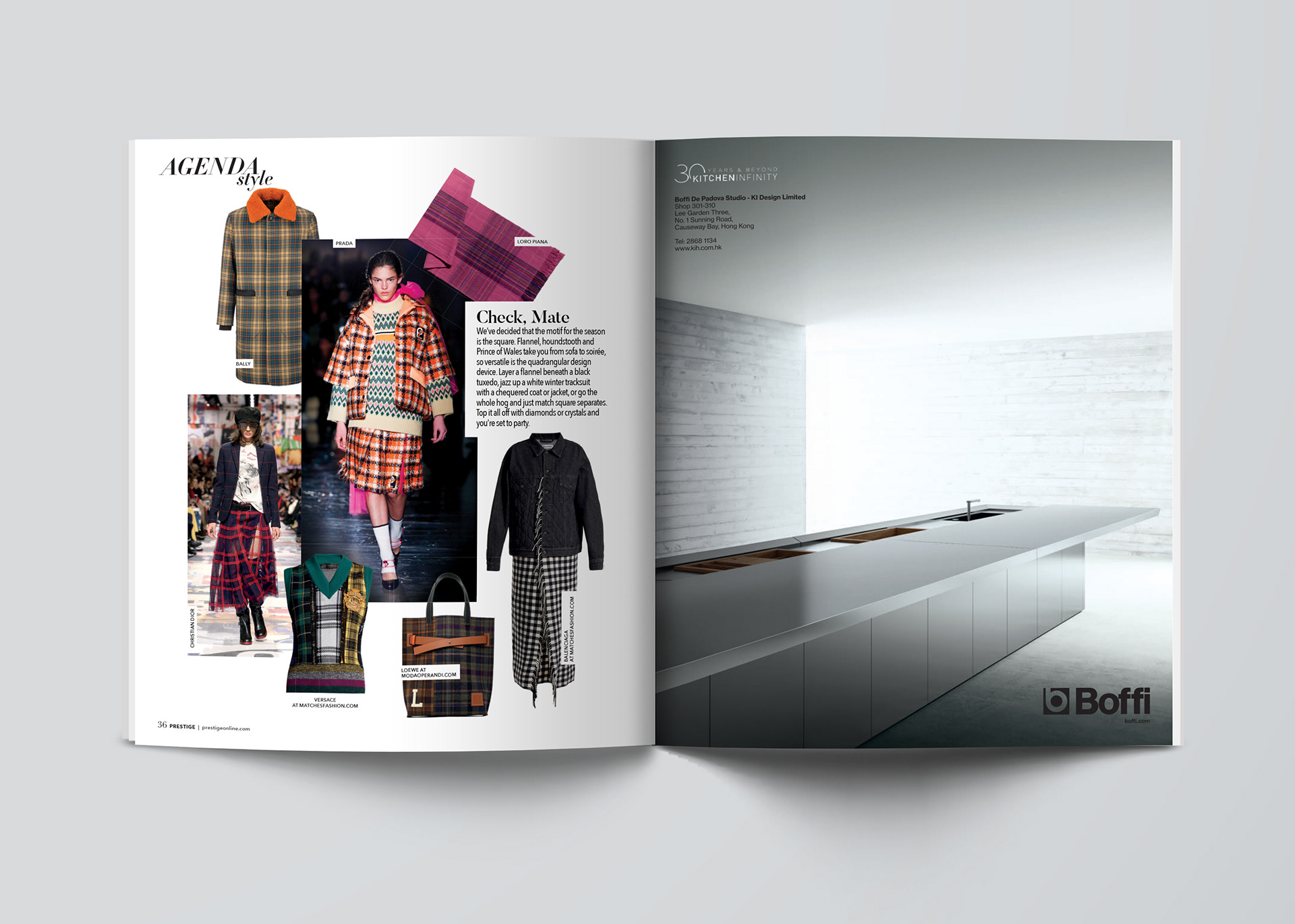
A carefully selected typeface to establish visual hierarchy and guide readers through the page
Off-grid placement of design elements to draw interest by creating tension and breathing energy into the page.